

Role: Lead Designer / Concept Developer
Company: Workman Publishing
Scope: Concept development, user experience design for print, accessibility features, visual systems
Time Frame: Nov 2015 - Jan 2016
Paint by Sticker is an innovative activity book series I conceptualized and designed, merging the satisfaction of paint-by-number with the tactile fun of stickers. This case study explores how I applied UX principles to make a physical product intuitive, accessible, and engaging across ages
Design Goal: Create a fresh easy to use sticker book format, that is inclusive, and original.
Product Goal: Engage user in fun and Mindful, that can travel with the user and not leave any mess
Problems:
-
Sticker book usually geared toward children those that are not are usually just decorative.
-
Puzzles have lots of pieces that can get lost and are not good for travel and the boxes are bulky
-
Coloring books and paint by numbers force you to bring art supplies which can be messy and get lost

Karen the Calming Hobbyist
Age: 61
Occupation: Retired Accountant
Location: Portland, OR
Tech Comfort Level: Low
Personality: Patient, detail-oriented, looking to relax
Goals
-
Stay mentally sharp and creatively engaged during retirement
-
Find a low-stress, meditative hobby
-
Share meaningful activities with her grandchildren
Frustrations
-
Paint-by-number kits are messy and require setup
-
Puzzles are satisfying but don’t feel creative
-
Many sticker books seem too juvenile or lack refinement
Why She Loves Paint by Sticker
-
Provides artistic satisfaction without the need for art skills
-
Feels calming and mentally engaging
-
Easy to pack and share with family
Leo the Neurodivergent Teen
Age: 15
Occupation: High School Student
Location: Austin, TX
Diagnosis: Autism Spectrum Disorder (ASD)
Tech Comfort Level: High
Personality: Curious, sensitive to sensory input, pattern-oriented
Goals
-
Engage in solo activities that offer calm focus and visual structure
-
Find creative outlets that don’t involve social pressure
-
Experience a sense of accomplishment without overwhelming stimuli
Frustrations
-
Many art activities are too open-ended or chaotic
-
Coloring books can cause frustration due to staying inside lines
-
Sensory aversions to glue, paint, or loud classroom environments
Why Paint by Sticker Works for Leo
-
Clear, rule-based structure appeals to his pattern-seeking brain
-
No mess or overwhelming tactile input
-
Satisfying visual transformation from blank page to finished art
-
Color-coded numbering helps organize the task and reduce anxiety
-
Provides dopamine reward loop from completing small, meaningful tasks

Users
Competition for this product come in 3 categories
-
Sticker and activity books
-
Paint by Numbers kits & Coloring books
-
Jigsaw puzzles
Sticker and Activity Books

Melissa & Doug Sticker Collection
-
Focus: Themed scenes with reusable stickers.
-
Strengths:
-
Open-ended creative play.
-
High-quality materials.
-
-
Weaknesses:
-
No structured guidance.
-
Overwhelming for younger or neurodivergent users.
-

Usborne Sticker Books
-
Focus: Educational topics with themed sticker interaction.
-
Strengths:
-
Learning-driven content.
-
-
Weaknesses:
-
Stickers serve educational reinforcement, not artistic creation.
-
Lacked iterative challenge.
-

Djeco Sticker Kits
-
Focus: Artistic sticker placements onto pre-illustrated scenes.
-
Strengths:
-
Visual design excellence.
-
-
Weaknesses:
-
No structured learning or skill tracking.
-

Kumon Sticker Books
-
Focus: Skill-building (shapes, numbers, patterns).
-
Strengths:
-
Clear progression of difficulty.
-
-
Weaknesses:
-
Limited aesthetic appeal or storytelling.
-
Jigsaw Puzzle
Competitive Analysis
Paint -by-Number

-
Medium: Acrylic or watercolor paint, applied to numbered canvases.
-
Strengths:
-
Highly structured artistic outcome.
-
Therapeutic and meditative process.
-
-
Weaknesses:
-
Messy; requires setup and cleanup.
-
Often intimidating for young children.
-
Lacks tactile engagement for those who prefer non-messy, fine-motor tasks.
-

-
Medium: Cardboard or wood puzzles forming a complete image.
-
Strengths:
-
Strong cognitive benefits (spatial reasoning, problem-solving).
-
Visually satisfying once completed.
-
-
Weaknesses:
-
Little creative control.
-
Can be frustrating for young or differently-abled users.
-
Not always portable or replayable.
-
Comp Quick reference
Features | Sticker/Activity Book | Paint-by-Numbers | Jigsaw Puzzles | Paint by Sticker |
|---|---|---|---|---|
Structured Guidance | ❌/✅ | ✅ | ✅ | ✅ |
Creative Output | ✅ | ✅ | ❌ | ✅ |
Fine Motor Skill Practice | ✅ | ✅ | ✅ | ✅ |
Visual Reward | ❌/✅ | ✅ | ✅ | ✅ |
Accessibility Focus | ❌ | ❌ | ❌ | ✅ |
Low Frustration / Replayable | ❌ | ❌ | ❌ | ✅ |
Mess-Free | ✅ | ❌ | ❌/✅ | ✅ |
Paint by Sticker Series positions itself to fills marketing gaps by offering:
-
Guided Artistic Creation: Users complete images by matching numbered stickers to corresponding spaces
-
Skill Enhancement: Activities designed to improve focus and fine motor skills
-
Broad Appeal: Suitable for both children and adults
-
Convenience: No mess or additional materials required
Conclusion
Before Paint by Sticker, no product truly bridged the gap between creativity, structure, and accessibility. By combining the satisfying structure of paint-by-numbers, the hands-on engagement of jigsaw puzzles, and the mess-free fun of traditional sticker books, Paint by Sticker introduced a groundbreaking new format that was instantly intuitive, wildly addictive, and refreshingly inclusive. It didn’t just fill a gap—it created an entirely new creative category!
Basic usability test
A cross sampling of users were brought into the office, were handed a sample
lo-fi version of the puzzle layout and a page of stickers and were asked to complete the puzzle.
Upon completion of the puzzle each was asked about how they felt about the process, then about any specific joys or frustrations

Early proto-type for testing

These were hand cut stickers

Original puzzle layout
Upon completion of the puzzle each was asked about how they felt about the process, then about any specific joys or frustrations
Findings:
General consensus was it was an enjoyable experience
Highlights
-
Progressive visual assembly led to creative satisfaction.
-
it was nice to not have to clean after art had been completed
-
users liked not having to obtain additional tool to complete the activity like crayons or colored pencils
Frustrations
-
Not having specific art on a piece lead to some placement confusion
-
Improper placement lead to potential white gaps in finished puzzle
-
Pieces with similar shapes and color values can get confused with each other especially for people with color blindness
Early user testing
Paint by Sticker was a brand-new concept with no direct precedent—a sticker-based activity book where users of all ages (5 to 85) could create artwork inspired by modern low-poly design. Users placed hundreds of abstract, polygonal stickers into corresponding spots to complete each image.
Designing this experience posed several challenges: the interface had to be intuitive, accessible to users with visual impairments, and consistent across a scalable product line. We also had to consider the limitations of print—managing layout constraints, minimizing clutter, and controlling production costs—while maintaining a visually engaging and functional experience.
Design Challenges, Solutions & Results
1. Designing for Accessibility
Challenge
The puzzles were composed of abstract polygonal shapes differentiated primarily by color. Relying on hue alone would make the activity inaccessible for users with colorblindness, low vision, or difficulty distinguishing tonal values.
Solution
We implemented a numbered sticker system, placing numbers inside each polygonal shape that corresponded directly to the same number on the sticker sheet. This guided users through placement based on position, not color.
Result
Initial tests revealed that number-only systems led to visual clutter and sticker-hunting fatigue. To improve clarity, we introduced an alphanumeric labeling system. Stickers were grouped by color and labeled with a letter, while individual pieces within the group were numbered (e.g., B22). This reduced the number range, improved visual scanning, and supported users who preferred either a visual or logical approach.

Numeric


Alphanumeric


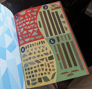
2. Organizing Sticker Sheets Efficiently
Challenge
Each puzzle required far more sticker space than its final image suggested. Bleed and die-cut spacing meant that a single puzzle could require up to four sticker sheets—driving up printing costs and potentially overwhelming the user.
Solution
We aimed to average two sticker sheets per puzzle, balancing simpler and more complex layouts across the book. By assigning simpler puzzles earlier in the book, we freed up room for more complex ones later.
Result
This strategy kept production costs within budget while preserving a clean, organized user experience. The puzzle progression also offered a natural skill-building arc—easier puzzles built user confidence, while more intricate ones provided satisfying challenges.
Vector graphic of Goldfish demonstrating the amount of pieces in one of the less complicated puzzles

3. Balancing Aesthetics and Functionality
Challenge
Sticker sheets needed to be visually engaging yet easy to navigate. Grouping pieces randomly led to confusion; grouping by size or shape alone didn’t account for users’ natural visual scanning habits.
Solution
We grouped stickers by color, then roughly by size, and introduced section letters to help orient users. Each section had enough visual breathing room to avoid crowding while keeping the design attractive.
Result
This resulted in a clean, open layout that made the sticker pages feel approachable and inviting. Users could easily navigate to the section they needed without visual overload.
Spread displaying clean and organized sticker sheets
4. Creating a Clear Labeling and Tracking System
Challenge
Users (and designers) needed a way to track hundreds of pieces without confusion. The system had to support multiple user behaviors—some preferred finding a number on the puzzle and locating the sticker, while others liked selecting a sticker and finding where it fit.
Solution
The alphanumeric system (Section Letter + Number) gave users multiple entry points. Each puzzle page also included a subtle visual legend, reinforcing the structure.
Result
This flexible system empowered users to choose their own workflow:
-
Locate a sticker and then find its placement.
-
Pick a placement and locate the sticker.
-
Ignore labels and rely on shape-matching.
This open-ended approach made the book more inclusive for different thinking styles, attention spans, and skill levels.
example of page layout focusing on color then shape

Close -up of labeling system
Design Challenges
Commercial Success
-
Millions sold worldwide: The Paint by Sticker series has sold millions of copies globally, proving the accessibility and appeal of my design system.
-
Expanded product line: What began as a single book concept expanded into a robust series including Paint by Sticker Kids, Paint by Sticker Masterpieces, Paint by Sticker Music Icons, and seasonal editions — a testament to its adaptable framework and audience resonance.
Production Efficiency
-
Reduced print waste: The alphanumeric and layout system helped balance sticker sheet counts across puzzles, keeping production costs consistent while minimizing excess sticker sheets.
-
Minimized die-cut misalignments: The bleed-aware layout with ample spacing reduced error margins during manufacturing and solid color field stickers meant there was no fear of art shift.
User Experience Outcomes
-
Inclusive for ages 5–Adult: From young children to retirees, the system allowed for cognitive and visual diversity in users — demonstrated through positive reviews and widespread usage.
-
Highly rated on platforms like Amazon and Goodreads: Books in the series regularly average 4.5+ stars, with frequent praise for clarity, fun, and ease of use.
Community and Educational Use
-
Used in classrooms and therapy settings to support:
-
Fine motor skills development
-
Color recognition and spatial reasoning
-
Mindfulness and relaxation activities
-
Impact Metrics
The design system was flexible yet structured enough to support new themes and user groups while preserving brand recognition.
Scalable Design System
-
Modular layout: The sticker labeling and organization system was applied across all books, making it easy for returning users to pick up a new title and immediately understand how to interact with it.
-
Color-agnostic labeling: Works equally well across color-rich images (e.g., parrots or pop art) and limited-palette puzzles (e.g., classic sculptures), maintaining usability across visual styles.
Visual and Brand Continuity
-
Unified aesthetic: The low-poly art style established a clear and recognizable visual identity that made the brand stand out in the market.
-
Consistent user journey: Each edition, regardless of theme or audience, followed the same intuitive flow: pick a puzzle, find a sticker using the labeling system, and apply it — no learning curve required.
Adapted for Multiple Audiences
-
Kids Editions: Featured simpler images, larger pieces, and easier labeling.
-
Advanced Editions: Smaller pieces, more complex art, and tighter spatial design — all built within the same system you created, proving its flexibility.
Cross-Platform Consistency
Results and Outcomes
Looking back, this project might seem straightforward—but it was full of learning moments and iterative problem-solving. One unexpected insight came when we tested adding color bleed to the puzzle pages to eliminate white gaps caused by “user error.” Initially, I was convinced the gaps would be frustrating or seen as flaws. But after user testing, the feedback surprised me:
“The white space adds personality.”
“It feels more like a mosaic.”
“It adds a level of challenge if I want to be precise.”
What I once saw as a problem became a feature. I don’t regret testing the pre-colored edges, but I’m glad we trusted our users. Their creativity filled in the gaps—with calm and joy.
As the product line expanded, I collaborated with a developer to create a custom script that automated the sticker numbering system. This tool let us organize pieces by section and sync the numbering between the sticker sheets and puzzle pages—making it scalable across multiple titles and editions.
Finally, I’m deeply proud of the impact Paint by Sticker has had on people’s lives—especially during the isolation of the COVID-19 lockdown. I’ve seen reviews that speak to its value as a therapeutic tool:
“Who knew stickers could be so therapeutic? It has changed my life. Whenever I need to de-stress, I turn to this amazing product and lose myself in creating beautiful works of art.”
And:
“I work with Alzheimer's patients and Hospice patients. Paint by Sticker has been wonderful for keeping my patients active and engaged. It’s also a great tool for socialization.”
That kind of feedback stays with me. It’s shaped the way I approach every new project—with empathy, intention, and a strong belief that thoughtful design can meaningfully improve people’s lives.