

Role: Research, design, prototyping, and testing.
Timeline ongoing
Design Goal: Create an English literacy learning resources that is approachable, fun and easy to use.
Product Goal: Engage user in fun and unimposing way to develop there reading skills
Why this matters: Adult literacy is a hidden crisis. Millions of adults speak English but can’t read it, limiting work, digital access, and everyday independence. Most tools are text‑heavy or school‑like, which can feel intimidating or discouraging.
LitQuest removes those barriers with a playful, low‑text, confidence building path into reading that meets learners exactly where they are.
Meet Budiwati:

She's a 27 year old small business owner born and raised in Raja Ampat, Indonesia
Users: Individuals who are relativly fluent in spoken English but lack literacy skills, including non-native speakers and those who have not had the opportunity to learn to read for various reasons

Wow!
Amazing where do I sign up?
Hi I'm here representing the Indonesian tourism board, We love your locally sourced and sustainable, you are a great fit to have attraction page. Should help drive sales for your business while helping the local economy!

Just pop on to our site and fill out the application
Great thanks

English?

I can't read English! This can really destroy a good opportunity

I need a way to learn to read. I need Something engaging that can quickly take me through the basics, and will also keep me motivated to keep learning
What this revealed
-
Many adult learners are fluent speakers but complete non‑readers, meaning even simple text labels become blockers.
-
Motivation is tied to real‑world goals (employment, independence), not abstract learning milestones.
-
Shame and fear of failure strongly influence engagement; the experience must feel safe, friendly, and non‑judgmental.
-
Navigation must rely on icons, audio, and clear visual cues rather than written instructions.
-
Lessons must be short, digestible, and immediately rewarding to maintain momentum.
Competitive Analysis
Interface
Navigation and Layout | Simple, tab-based with clear progress tracking | Scrollable library format | Course-based, modular structure |
Visual Style | Gamified, colorful, engaging characters | Clean UI with audiobook-style | visuals Simple, engaging, memory-focused |
Reading Experience | Readability Large, bold fonts; spaced text for clarity | Dual-text display with highlights | Simple text blocks with pronunciation aids |



Hmmm what can be put together that has a competitive edge with these insights?
Accessible, high-contrast, intuitive gamified |
Designed for non-readers, clear iconography |
Dyslexia-friendly fonts, customizable contrast |
Engagement and User Motivation
Gamification | Gamification XP points, streaks, leaderboards | Interactive reading challenges | Memory training, streaks Progress |
Personalization | Adaptive difficulty, AI-based lesson suggestions | User-selected stories & texts | AI-driven vocabulary repetition |
Community
Features | Social leaderboards, clubs | No direct community engagement | User-generated content, shared courses |
badges, real-world goal tracking
Personalization |
Custom reading paths based on literacy level |
Peer support, live tutoring options |
Learning Features & Tools
Progress Tracking | Levels, badges, daily goals | Reading time tracking | AI-driven spaced repetition |
Audio Support | Text-to-speech, native speaker audio | Side-by-side audio-text sync | Native pronunciation clips |
Offline Learning | Limited, premium only | Yes | Yes |
Story-based milestones, real-world reading benchmarks |
Interactive read-aloud & speech recognition |
Is a must! |
Accessibility& Inclusivity
Multi-Language Support | 40+ languages | Multilingual audiobooks | 20+ languages |
Voice & Audio Feedback | Voice & Audio Feedback | Text-to-speech, voice lessons | Audiobook narration |
Text Customization | Text Customization Basic font & size settings | Default settings, limited control | No major customization |
Focused on English literacy |
Native speaker clips |
Full customization (fonts, contrast, modes) |
Most literacy tools assume users can already read menus, text labels, and multi‑step onboarding. None offered a fully icon‑driven, audio‑guided experience for true beginners — a clear gap in the market.
This confirmed LitQuest’s focus on:
-
ultra‑low text
-
consistent iconography
-
audio‑first guidance
-
dyslexia‑friendly visuals
-
a progression system that reduces overwhelm
The analysis made one thing clear: LitQuest isn’t just another literacy app it’s built for learners who’ve long been overlooked.
Foundations of learning to Read
identify the main idea of what is written
Expand vocabulary and start to focus on user needs

Vocabulary
Text comprehension
Phonological sensitivity and
blending
Syntax
Phonic Awarness
Learn the Alphabet and the sounds each letter carries
Learn combination letter sounds like th,, sh, tion,, and letter blending
Basic sentence structure
These literacy foundations directly shaped the product architecture. Each module maps to a cognitive skill:
-
Phonics → sound recognition and letter‑sound mapping
-
Chunking → decoding and pattern recognition
-
Syntax → comprehension and meaning‑making
By grounding the interface in learning science, every screen supports how the brain actually acquires reading skills. This ensured the product wasn’t just visually accessible — it was pedagogically sound.


So this is how you are going to start my literacy journey?
Design architecture

Wireframes
Progression map:
Designed to make the journey to reading clear.
Lesson One:
Connecting sounds with letter forms.

First test:
Test how much of the Alphabet the user has learned.

User testing

Insights:
-
user is engaged by the gamification design
-
Buttons and interactive elements need to be more clearly defined
"Well this is more than a little confusing I don't know what's a button and what isn't. I do like the idea of a map though reminds me of candy land"
"This is a lot to memorize all at once maybe it can be broken up into smaller parts?
And that user bat at the top take up a lot of space for the amount of information its giving me!"
Insights:
-
keep the information bite sized
-
streamline screen elements to reduce clutter
"Again having to memorize the whole alphabet all at once is a lot and only passing if I get all 26 correct in a row to move on makes me feel overwhelmed "
Insights:
-
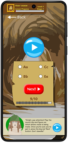
Make tests shorter to increase success rate and help user stay engaged, this should help the user be more consistent


User testing
Mockup
OK! that sorts out a manageable amount of content to consume. What about incentive




For adult non‑readers, the emotional side of learning is as critical as the cognitive one. Shame, fear of failure, and past school experiences can derail progress fast.
Gentle rewards, avatars, and small achievements create positive reinforcement that celebrates consistency over perfection — helping learners build confidence and stay engaged through early challenges.
Achievements:
Unlockable gear and customizable avatars
Key UX decisions
-
Map‑based progression reduces cognitive load by showing only one clear next step, preventing overwhelm.
-
Icon‑only navigation removes early reading barriers and supports universal comprehension.
-
Bite‑sized lessons align with cognitive load theory and help learners build confidence quickly.
-
Consistent button shapes and shadows emerged from testing, improving affordance for users unfamiliar with digital interfaces.
-
Audio guidance ensures users can navigate and learn without relying on text.
These decisions transformed the product from a content delivery tool into a guided learning environment.
Prototype
If you would like to explore the prototype click the link below:
The prototype was designed to validate:
-
whether users could navigate an icon‑based interface without text
-
how effectively audio guidance supported onboarding
-
whether chunked phonics exercises felt achievable
-
how users responded emotionally to early successes and failures
-
whether the progression map communicated clarity and momentum
These goals ensured the prototype tested the experience, not just the visuals.

Results and Outcomes
Developing LitQuest has been an adventure in its own right! Discovery, iteration, and problem-solving being perilous side quests along the way. Initially, one of the biggest challenges was designing an interface that catered to users who couldn’t read while still being intuitive and engaging. Traditional navigation patterns often relied on text-based instructions, which created an immediate barrier. Through testing, I realized that incorporating voice guidance, icon-based navigation, and interactive feedback was essential in making the experience accessible.
Another hurdle was ensuring that users felt motivated rather than overwhelmed. Early versions of the app had too many options upfront, making it difficult for users to know where to start. Simplifying the onboarding process and integrating gamified progression, visual cues, and real-time feedback helped reduce hesitation and kept learners engaged.
One of the most enlightening moments came when I observed how users interacted with audio-visual learning tools. I initially underestimated how crucial word chunking, phonetic breakdowns, and repetition were for retention. Once implemented, these features significantly improved user confidence and engagement.
Through continuous testing and iteration, I learned that simplicity, accessibility, and personalization are key to an effective literacy learning tool.